Brief
Produce designs for a set of three high impact posters that deliver a personal identified message derived from your research into part one of this brief.
The three posters should work as a set or series and be visually consistent. The first must be produced solely using type, the second solely with image and the third a combination of both type and image.
Background/ Considerations
- Focus on what you are trying to say and avoid generalisations and vague messages.
- Keep it simple and to-the-point.
- Are you making a statement, delivering facts or posing a question?
- You should consider and investigate a broad range of possible visual solutions before making your design decisions.
- Tone of Voice.
- Memorable, immediate high impact and clarity.
- Challenging, potentially controversial but appropriate and not offensive.
- Factual, statistical, informed and specific.
Mandatory Requirements
Each poster should be supported by comprehensive visual research into frame, format, composition and content.
Use notebooks to document your ideas. Use worksheets to develop your visual investigation.
Deliverables
You are restricted to the use of two colours plus stock.
Three posters (2:1 format) presented at a3 scale (but not a3 format)
Studio Deadline: Friday 9th November 2012
Module Deadline: 23rd November 2012
-------------
Further Research required for ideas and development for 3 posters:
Through this images, I tried to inspire myself with contemporary ways of using a limited colour scheme:
 |
| The overlaying of different colours is a contemporary take on the two-colour limit. Photography could also be changed in photoshop to just two colours, giving a lot more freedom to the design than previously thought! I really like the way that the typography in this piece is a negative of the colour as well, because it almost acts as a third colour. |
 |
| Although this image uses around 4 colours, this same effect could be portrayed through just two. I really love the vibrancy of these, but not entirely sure how I could incorporate this style into my work. |
 |
| Two contrasting words could be overlapped, reflecting on the two constrasting views on political correctness and what is deemed as appropriate/ innappropriate. Perhaps 'correct/ incorrect'?, 'safe/ offensive'? |
 |
| Again, the two contrasting opinions could be portrayed in two different people/ characters. This simple imagery could be an interesting concept to communicate my message. |
 |
| (minus the bicycle) the use of type as the main graphic can fill the element lost when the image is taken away. I really like this layout and how all of the typography fits together consistently. |
 |
| There are only 3 colours used in this image, and their half tones. Using half tones can give the illusion of there being more colours than there are, and because they are permitted in our designs, this could be a useful way of executing the designs. I also like the way that the drop shadows on the text fill in the missing image element, while still being type. |
 |
| I really love the way that the typography is the main feature of this design. The typeface is very feminine and curly, and so nearly fills the page. This could be very good inspiration for my Snow White/ Jack and the Beanstalk ideas. |
Investigating into layouts with type and image:
 |
| I love the way that the image does not interfere with the actual typographic design because they are only small, it only emphasizes the typography. The different fonts used help to accentuate the meaning of every word, but the design still doesn't look too busy because of the blank space and respectable border. |
How can censorship be subtle? Looking at different ways of hiding/ censoring content:
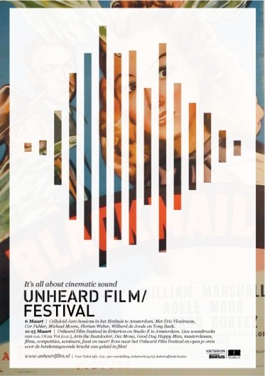 |
| Although this is to give the impression of sound waves, I really like this vertical blind effect, only revealing some of the image behind. I could apply this to my design, with the image behind being something considered politically incorrect, but not actually offensive. Maybe an image of a housewife washing up, considered sexist? |
 |
| This is a really unusual way of censoring type, and gives the type character. The curl of the ampersand around the side of the screen shows it is embarrassed, or ashamed. I could use this with a statement about free speech, and use it to show how people are now becoming embarrassed/ ashamed of their own opinion, for fear it will be politically incorrect, therefore offensive. |
Typographic use of the asterisk:
 |
| This was the main inspiration for the use of the asterisk in my typographic design ideas. The pretty, ornate typography is ruined with an interruption of terms and conditions. This could reflect how censorship and the use of political correctness is an implication on modern society/ an interruption of free speech. |
How can symbolism tell a story/ message?:
 |
| These are really clever designs in that they communicate a message with type as the image. Although I'm not entirely sure what I could do that would connect to my message. |
 |
| This Christmas design relies just as much on the typography as the colours and images used. I really like this typeface because it is immediately festive and decorative. It is innocent in it's message- this could be censored to show the hypersensitivity surrounding political correctness. |
Looking into ornate styles for my Storybook style for Snow White/ Jack and the Beanstalk ideas:
 |
| The intertwining, sketchy style is typical of traditional typography. Perhaps the incorporation of banners and serif typefaces could enhance my own designs. |


These novel covers by Jessica Hische are beautiful and innocent in design. The perfect layouts and simple vector images are good inspiration for my storybook style designs. If graffiti were to be applied to this, it would ruin it, in the same way that arguably political correctness can implicate free speech.
Research into Book Of Hours/ Biblical styles for bible quote:


These visuals for the book of hours can have the same effect as the storybook cover designs. They could be graffiti'd on with a statement about political correctness. If I am to portray this style, the inclusion of floral themes, blackletter text and an oversized drop cap is essential
Research into 50s photography with potentially sexist themes:
 |
| This image would be perfect because it only uses 1 colour and half tones, and is clear about the subject matter: a housewife enjoys cooking food in this image. |
 |
| This advert implies that womens desires only revolve around household chores, in a potentially sexist manner. Something like this could be used to show the viewer that things that are offensive today are nothing compared to those of the past. |


Banksy: the lifestyle you ordered is out of stock (inspiration for my idea: Sorry! The freedom you ordered is currently out of stock)

Nudity in Disney Characters:
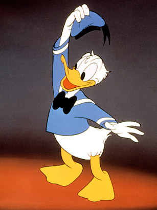 |
| This image clearly shows the fact that donald is nude from the waist down and so would be a good image to use for this idea. |

 |
| Again, these past two images of Minnie clearly show her underwear and could be effectively used in my campaign, perhaps with a censor bar? |
Old Bear Stories: traditional innocent child-aimed illustration:
 |
| Old traditional illustration of children's books is sweet and innocent. Could this same, sketchy style be applied to a gollywog toy? Would it have the same heart-warming feeling to the reader? |
No comments:
Post a Comment