Here is a bit of background information on my given film: 1963's 'The Terror'.
Firstly, I decided that the best way to research the film would be to watch it! I quickly realised that this is definitively in the B movie gothic horror genre!
I also realised after watching the whole film, the strongest imagery that doesn't reveal too much about the plot is in fact in the opening scenes:

The castle that the Baron lives in.

The opening title in a very similar typeface to 'Deming EP' from Lost type. This would be a good typeface to use!

The bird silhouette is also great symbolism that doesn't reveal too much about the plot.
My notes on the film include:
- trail of blood
- bird silhouette (at first thought was a dove because it was shown in white)
- different silhouettes and shadows
- crumbling archways of the Baron's castle
- crashing waves of the ocean
- spinning compass
- dark forest
- man on horseback
- castle
- Helene/ Isla ghost/ girl silhouette
B movie Gothic Horror posters:
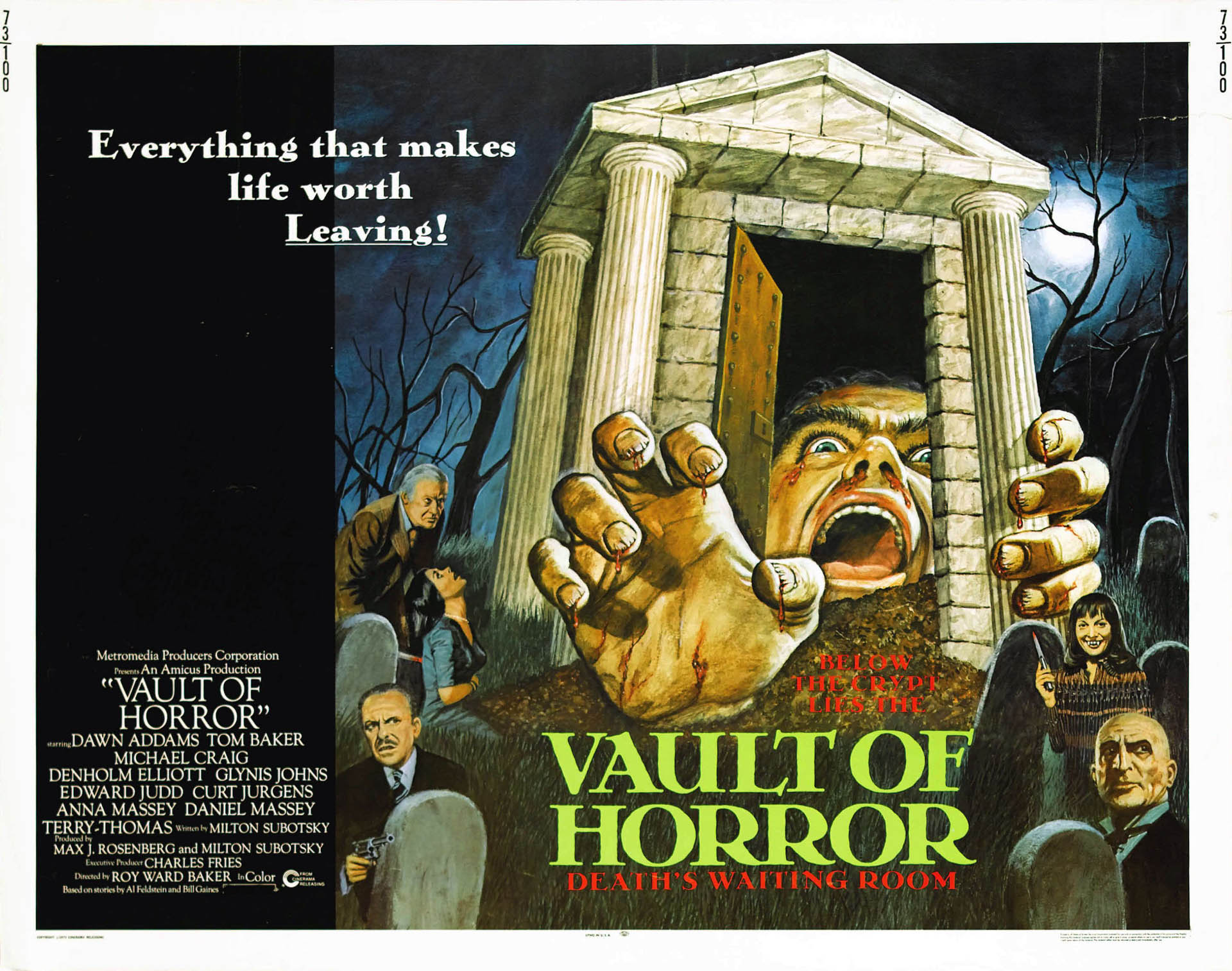
The rather abstract imagery and cheesy slogan is particularly notable in B movie style.

This poster is particularly useful in it's use of only 3 colours: only 2 greens and black with the stock. The consistent layout in the B movie posters is the titles outside of the border of the illustration.

Another cheesy slogan and title outside of the border of the illustration. I really like the typefaces used on this poster because of their supposedly scary style.

This is the original poster for 'the Terror' circa 1963. I really dislike this poster because of it's never ending colour scheme and strange layout, but it counts itself for being a classic of B movie horror, which is a really strong style.
Steve Simpson Type 'n' Texture:

After flicking through my Behance feed, I came across this particular piece from Steve Simpson. I really love the textures he uses in his work, and thought that maybe this could be a suitable treatment for the lettering on my poster?
Tom Whalen Designs:

The Wolf Man poster on the right particularly inspired me because of the moon in the top right corner. These designs drew my attention because of their limited colour palette and vector illustration style which is what I am intending to use in my brief.
No comments:
Post a Comment